above> image courtesy foster + partners
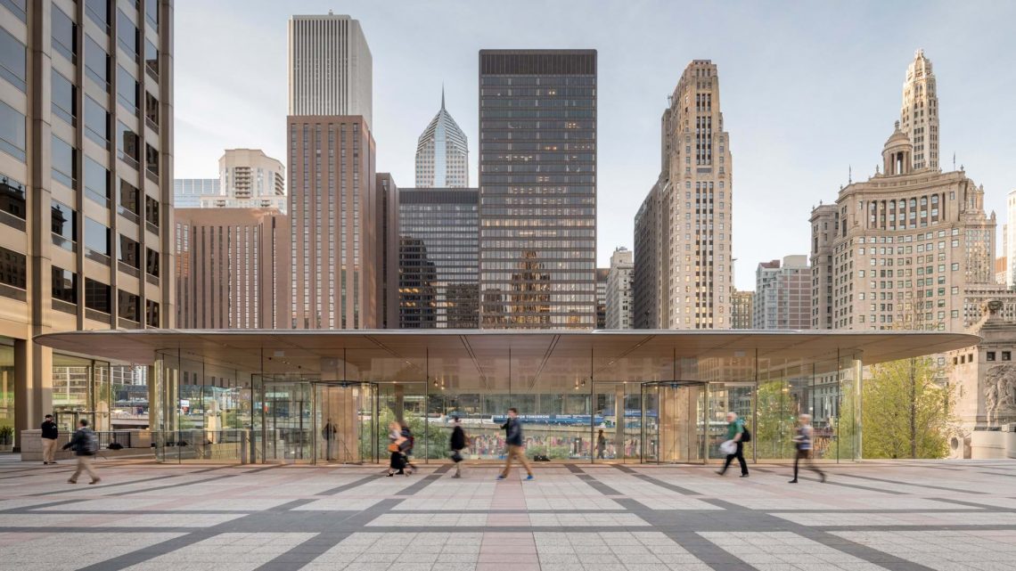
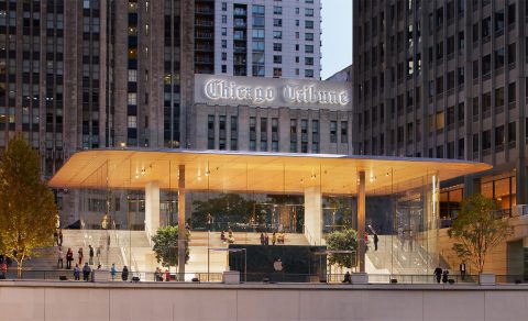
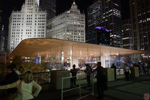
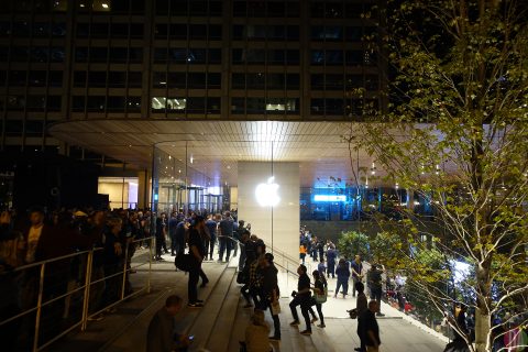
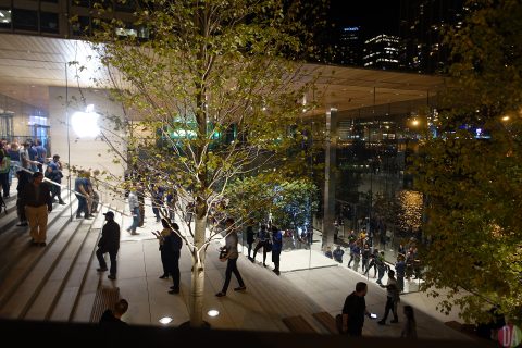
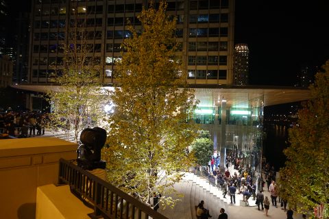
we were never worried. apple michigan avenue delivers a better than anticipated airy, transparent, floating paper-thin carbon-fiber roof architecture & design proclamation.
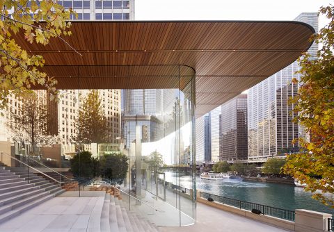
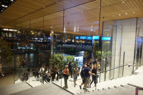
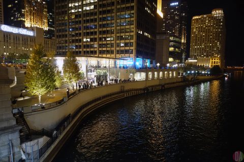
“apple michigan avenue is about removing boundaries between inside and outside, reviving important urban connections within the city,” said jony ive, apple’s chief design officer. “it unites a historic city plaza that had been cut off from the water, giving chicago a dynamic new arena that flows effortlessly down to the river.”
above> video courtesy apple
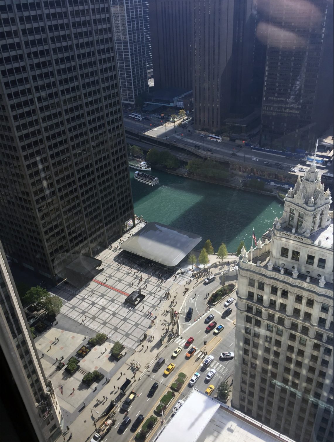
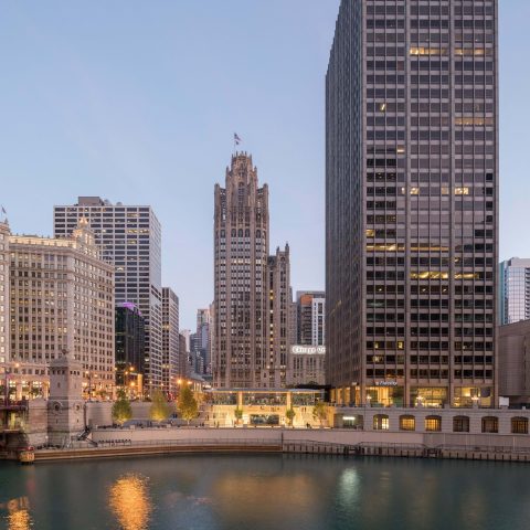
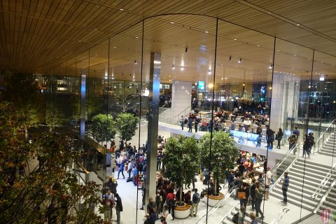
the airiness, a result of a roof supported only by four columns inside and a perimeter of glass walls that range in height from 14 – 32 feet. the glass sheets are laminated together offering both structural support and seemingly – seamlessness. above> image courtesy foster + partners
if you think it looks expensive, it is. $27 million or $1,350 per square foot.
conceivably project architect stefan behling’s best achievement was integrating the store to the newly developed riverfront. the city in recent years has invited all to come down to the river’s edge. the apple store has hands down won best concept in the category of a building to date. in contrast, just west of the new apple store, a new trump tower chicago presents a fine looking, but it has come to pass, not so inviting river’s edge landscape.
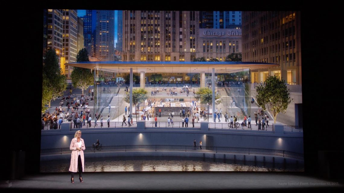
above> last september, apple’s senior vice president of retail, angela ahrendts, shows off an illustration of the company’s newest flagship store in chicago, an uber example, of open gathering places and avenues, dubbed “apple town squares.” the company will also invite creative professionals into its facilities, she says, for something called “today at apple.” image courtesy apple
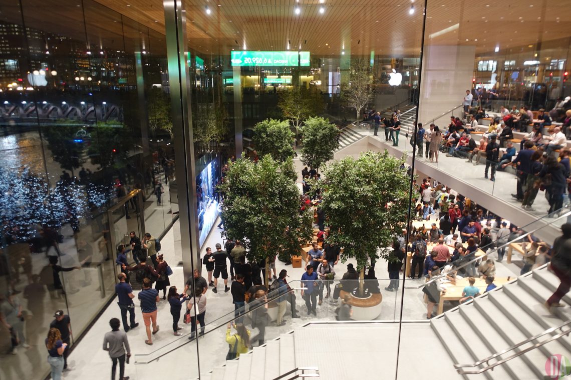
at the chicago opening apple ceo tim cook reiterated that though all apple stores are meant to sell product, the philosophy is not akin to the creaky grocery store crammed with just shelves of products. it’s more like a fresh food market with a restaurant, a wine bar with baby grand piano, where some people hang out, get hungrier, and maybe buy edibles on the way out.
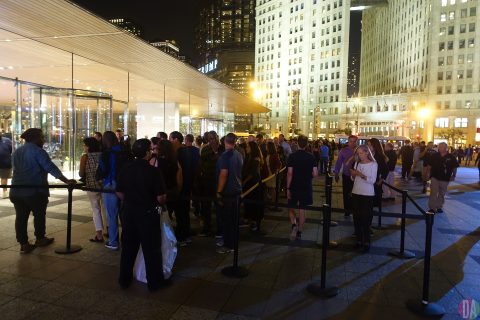
the former michigan avenue flagship which opened in 2003, is an example of the evolution, from at first a lot of shelves and tables selling product. but something new was added – a service/genius bar and a theatre for how-to classes. as the store evolved the service and training areas grew and replaced the shelves. whatever, the original store became unique among all michigan avenue stores, possibly all stores in downtown chicago – there were lines waiting to get in daily – i was in those lines – and the store opened one hour earlier, 9am, than most other retailers. a scary thought, maybe there are lines in other cities.
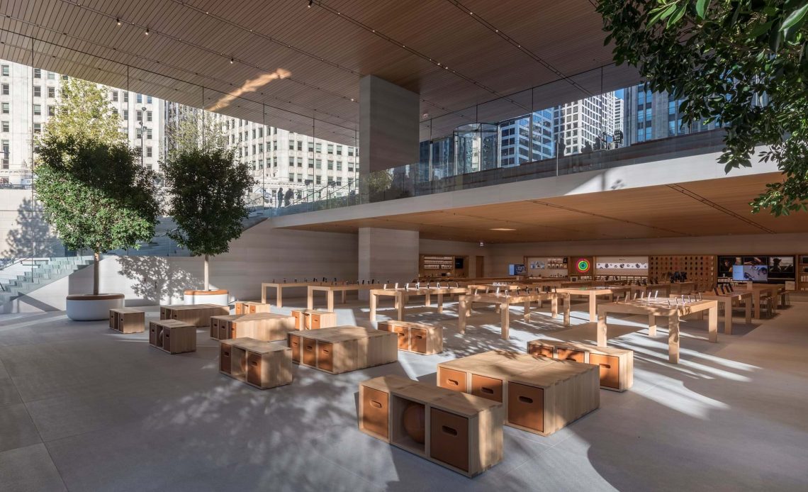
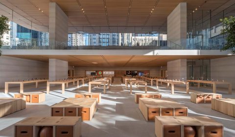
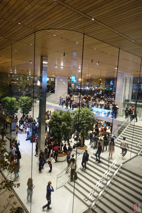
below > the new sales floor, in the foreground are boxes to sit on to watch a large video screen, further back tables for playing with new products and way, way back are shelves of product. image courtesy foster + partners
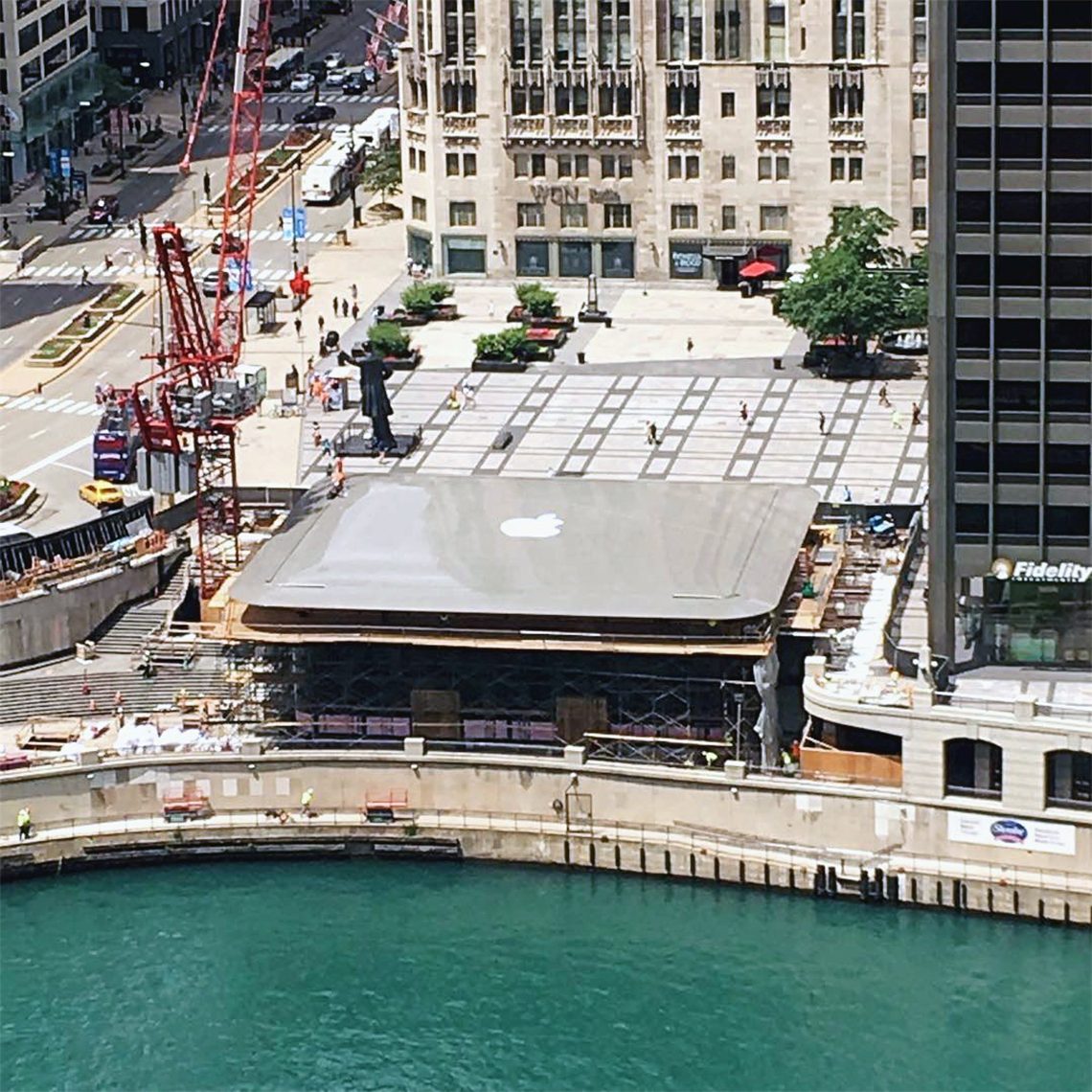
above> putting an apple logo on the roof was considered – a paper logo test a month prior to the grand opening. amid worries that a logo in this setting marginalized brand and architecture, the concept was discarded.
now with construction complete, DA lobbies for reassessing the alluring relationship of iconic silhouette and logo.
we fully endorse a less is more philosophy regarding credible achievement. here, end-product and team are exemplary. but there’s also this… it’s not what but how. afterall, the laptop roof concept itself, wasn’t an afterthought and didn’t get anyone nervous. and there’s a carefully located logo inside at streetlevel, nice.
an equally important philosophy – avoid decisions that may be construed as a miscalculation. this isn’t just about a building or a brand. this is about art. “art is never finished, only abandoned.” ~ leonardo da vinci
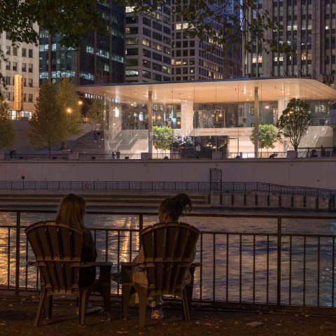
above> courtesy @lynettegrinter
architect> partner and project architect, stefan behling of foster + partners. the firm also created apple’s mother ship headquarters in cupertino.
